Maggie’s to trial redesigned fundraising collecting box
Design agency Layer has created a new design for the fundraising collecting boxes of cancer charity Maggie’s.
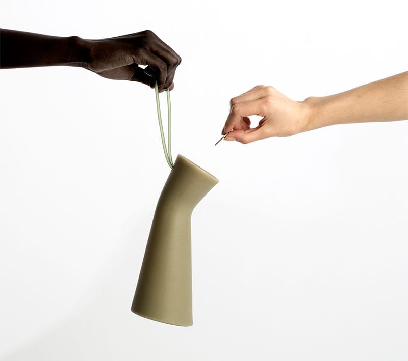
The 25cm tall silicone collecting box, called the Change Box, has been designed to be easy to hold, and features a tilted head that leans toward the donor, to encourage giving and make giving easier. The single colour box is available in red, grey and blue.
Layer claims that it is “the first agency to re-think the much maligned charity box”.
Most collecting tins are held around the middle or the bottom, with the weight of the coins above the wrist. Layer‘s ergonomic design takes the opposite approach.
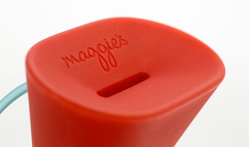
Layer’s design tilts the top of the collecting box slightly towards the donor.
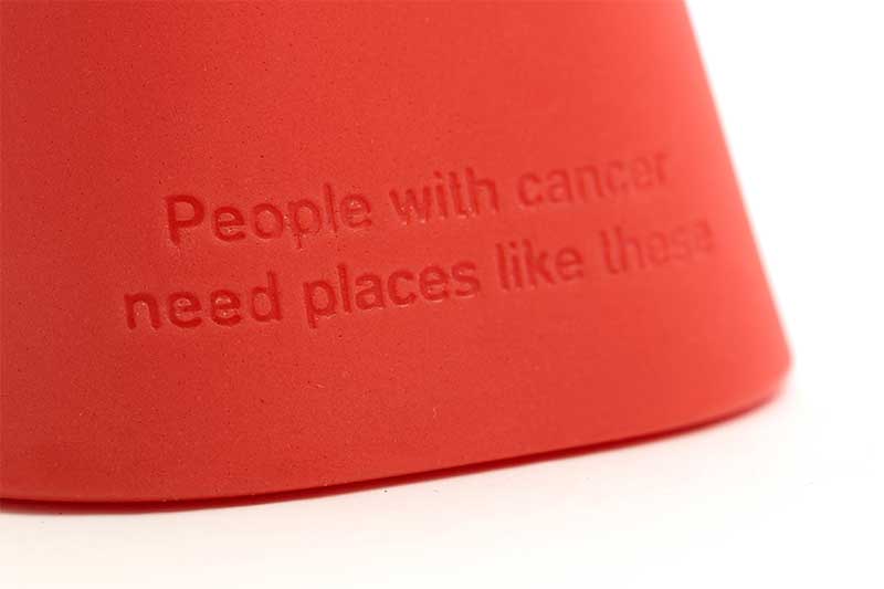
The coin slot at the top, big enough to accept bank notes of course, is accompanied by an engraved logo of the charity. At the base of the box is the engraved wording ‘people with cancer need places like these’.
Indeed, the smaller footprint of the box (10cm width) means that it occupies less space on countertops, while the height of the box and its bright colour attracts attention.
Maggie’s is trialling the new design against its current traditional design to see which works better.
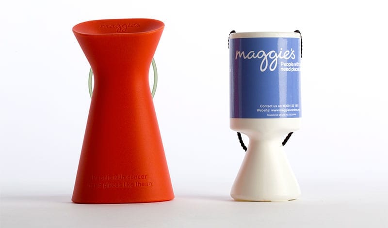
The new and current Maggie’s collecting box designs.
Maggie’s is no stranger to design. It has worked with renowned architects and designers including Thomas Heatherwick, Zaha Hadid Norman Foster on the designs of its Maggie’s Centres.
Benjamin Hubert, Layer’s founder, said:
“We saw a big opportunity to evolve the charity collection box into a device that more readily represents the values of a great organisation like Maggie’s, and through its design raise increased funds to help support people living with cancer.”
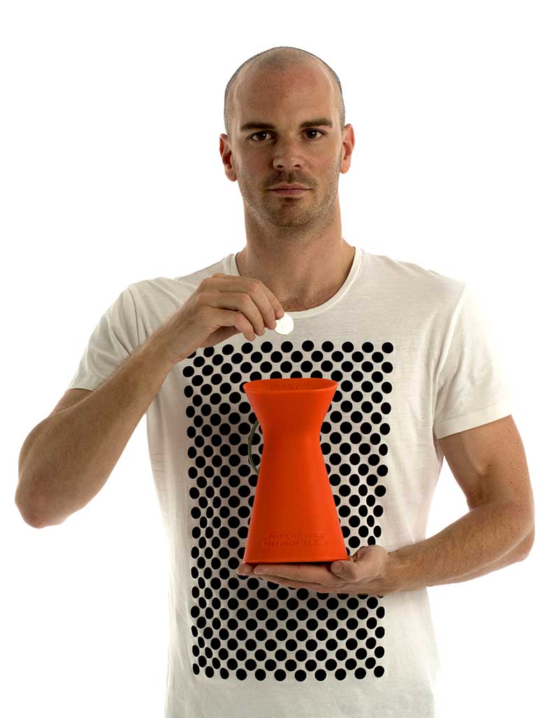
The Layer-designed collecting box in action.
Maggie’s provides free practical, emotional and social support to people with cancer and their family and friends.
Sarah Matthews, Marketing Director at Maggie’s, commented:
Advertisement
“Architecture and design are vital to the care Maggie’s offers. We are excited by the potential for a new charity collection box which reflects our strong design ethos, to help raise much-needed funds to support people with cancer and their family and friends. We will be piloting the new design over the coming months. Benjamin and his studio have demonstrated great insight in understanding the needs of our organisation and that of our supporters. They have sensitively captured our design philosophy and values”.


