10 ways to increase donations through your website
Behavioural economics is changing our understanding of how people make decisions. While we like to think we are rational, considered beings, the majority of our daily decisions are made quickly and often irrationally. This has huge implications for us as fundraisers, not least in the way we engage with donors making ‘impulse’ or ‘spur of the moment’ gifts.
Here are 10 simple things you can do to improve your website, using learning from the field of Behavioural Economics. This blog is based on a session delivered by David Burgess at Tate Liverpool on Thursday 11 February 2016.
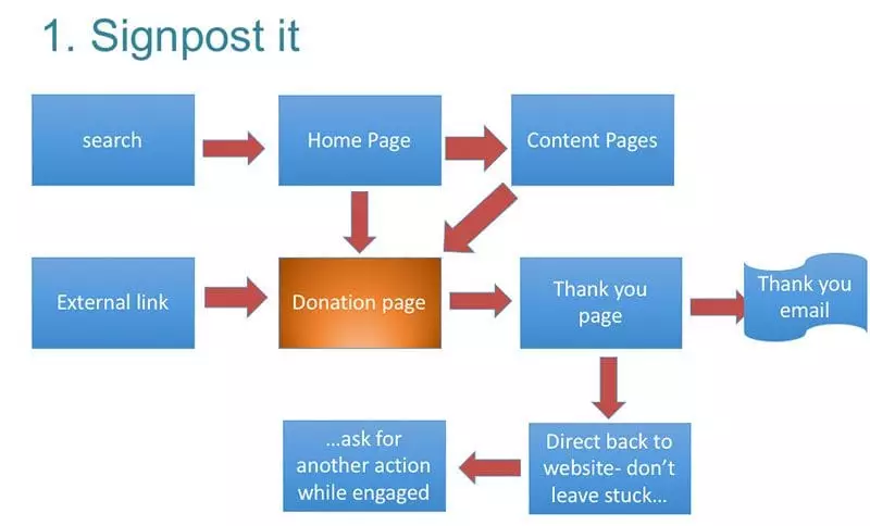
1. Signpost it
People need to be able to find your website, and your donation page, in as few clicks as possible. Help them do this by:
Improving your Search Engine Optimisation (SEO)
Thinking about the words or phrases potential donors might use to find you, how high does your webpage come in a Google search? If you are not on the first page, (and ideally in the top 5 hits) for these searches you need to improve your SEO. Regularly updating your webpage is one way of doing this, while using a Google grant to secure key adwords is another.
Advertisement
Having a “Donate Now” button
This signals your need for support, and makes it easy for anybody looking to donate in respond to an offline ask.
Planning the donor journey through your site
The majority of potential donors visiting your site haven’t come there to make a donation (sorry!). You need to think about what information they are looking for, how they might travel through the site, and how you can incorporate this into your fundraising story. For example, do you have an information page about a project that needs funding? If so, does this page communicate your need for help, how people can get involved and a quick link to your donation page or other response mechanism?
Not abandoning them
After somebody has made a gift, don’t abandon them on a thank you page with nowhere else to go. Redirect them back to the main site or, better still, suggest other ways they can help. Having just donated they are more likely to respond to other asks – such as signing petitions, sharing the campaign or considering other methods of supporting.
2. Humanise it
People care about the one more than the many, and respond more to stories about individuals than large groups of people. (The response to the pictures of Syrian boy Aylan Kurdi demonstrate this). Large numbers can be hard to process or visualise, and can make the problem seem unsolvable. Focusing on one person can feel more tangible – it is clear how a gift can make a difference.
Look for opportunities in your website copy to humanise your work and shine a spotlight on individual stories – including beneficiaries, success stories, charity staff (your heroes and heroines) and donors.
3. Contrast it
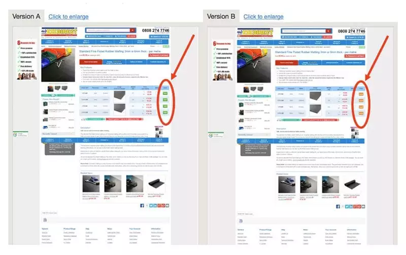
If asked to guess which version of this website performed best in a split A/B test, most would assume Version A, with the green buttons. When asked to explain why, the most common answer is “Green means go”. In actual fact, Version B significantly outperformed Version A, resulting in 22.7% more sales.
The reason is colour contrast. The orange in Version B doesn’t fit with the colour palette of the rest of the page. The high contrast draws attention to the button.
While this won’t please your website designer, having a “Donate Now” button that is a contrasting colour to the rest of the page will draw attention and lead to a greater click-through rate.
4. Specify it
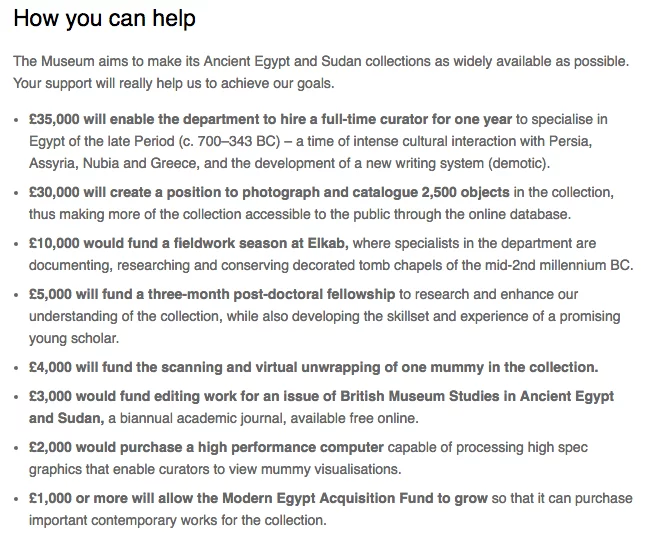
Articulating what a donation will tangibly achieve is a great way of increasing the number and value of gifts. Be specific about what you need support for and include a gift ladder to show how the donation will be used.
The British Museum website has a nice gift ladder for their Department of Ancient Egypt and Sudan:
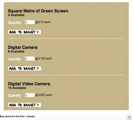
whilst the Lyric Hammersmith’s interactive webpage enabled donors to buy specific items as part of their capital campaign:
5. Anchor it
Behavioural Economics studies show us that we can be subconsciously influenced by background information, even when that information is random or irrelevant to the decision we are making. Even judges are susceptible to it.
Numbers are particularly effective anchors. Consider the options available in your likert scale (the suggested donation levels on your website). Higher suggested amounts will lead to higher average gifts…but only up to a point. Similarly, pre-ticking your intended average donation amount, or prefilling this field will anchor that amount, whilst also suggesting this is the “social norm”.
6. Stimulate it
Pages that list previous donations (such as most crowdfunding sites) can also have an anchoring effect. If somebody makes a large donation, the average value of subsequent gifts will also be higher. However, the presence of a much lower gift will reduce the average value of future gifts.
Finding donors to make larger gifts at regular intervals throughout the campaign, or immediately after a small gift, will help increase the overall average of gifts.
7. Frame it
People don’t like too much choice. Providing too many options for people to consider will reduce the overall response rate. Think about how many things you are asking people to do on your website. Identify the priorities and consider whether to remove some of the others.
You can always promote them on the thank you page as a “next step”.
8. Complete it
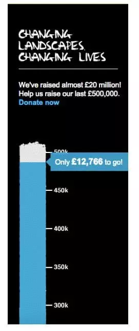
Campaigns that reach 10% of their target often see a small increase in momentum. This drops off around the 45-55% mark. However, campaigns that get to 90% see a huge increase in donations as a result of “endowed progress”.
Clearly articulating your target and showing your progress will encourage others to support.
Websites also show progress through the donation or purchase process. Having this mechanic in place can increase the number of people that complete the action, rather than abandoning half way through.
9. Integrate it
Many organisations use their online donation platforms as digital donation boxes, with little thanking or stewarding. Ensure you have a stewardship plan in place for online donors. Thank them, show them the impact of their gift and offer opportunities to support again.
And remember – digital communication is just one of the channels open to you. While it can be a quick and effective way of conveying a message it can also feel impersonal. Using a mix of channels can have more impact and strengthen a relationship, paving the way to future gifts.
10. Test it
Seemingly small details can have a huge impact on click-through and response rates (as seen in the contrast example above). Carrying out A/B testing with different images, language, layout and designs can help ensure your site is performing as efficiently as possible.
You also need to ensure that the donor experience is the best it can be. To test this you need to donate yourself. Experiencing it from the donors’ point of view will help identify things that work, things that don’t and things you should change.
Get people outside of your organisation to test it as well, as language or phrases that make sense within your organisation can be misconstrued by donors in the real world.
David Burgess (@davidburgessmc) is a Fundraising Consultant with The Management Centre (=mc) @MgmtCentre, and Co-Director, The National Arts Fundraising School @mcNAFS
- Interested in learning more about digital? You might also like this blog post:
Main image: choosing direction by Gwoeii on Shutterstock.com


