10 charities that make the most of their About Us page

Howard Lake | 29 May 2017 | Blogs
The good old ‘About us’ us page. It’s often the poor relation to most other pages on a website when it comes to compelling copy and engaging design. Yet it’s one of the most visited pages of a website as well as being one of the first a visitor will read.
Crucially, it’s usually a gateway to pages which take the reader deeper into their relationship with the charity. So can charities really afford to ignore it? After all, aren’t we all looking to deepen our relationships with our ambassadors and supporters?
Let’s take a look at those charities which are bucking the trend and making the most of their About Us page.
1. Charity:Water
Making the most of the page by… engendering trust
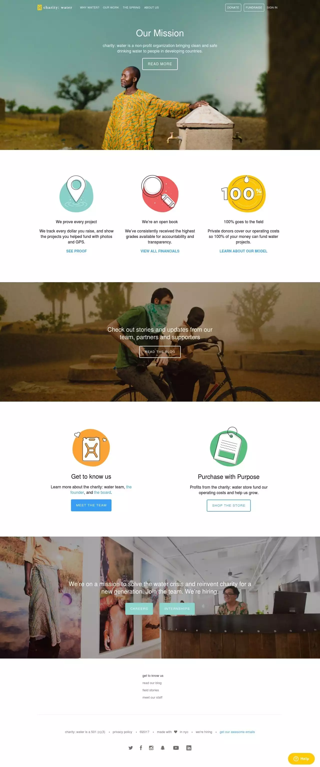
If engendering trust is the objective of this page then they’ve got it spot on. Bold statements disguised as headings focus on transparency and outcomes, a refreshing approach shared in a visually effective way. Their USP is clear in the space of just five words. The design and content mirror their mission: simple yet effective. The usual corporate information is all there, creatively packaged into meaningful bite-sized chunks making it easily digestible and shouting out to the Millennial audience.
The use of mixed images – modern-day icons scattered amongst portrait-like pictures are a million miles away from the traditional charity look and feel which helps set them apart from the traditional model reminding you of their USP.
2. Blue Cross
Making the most of the page by… making the ask
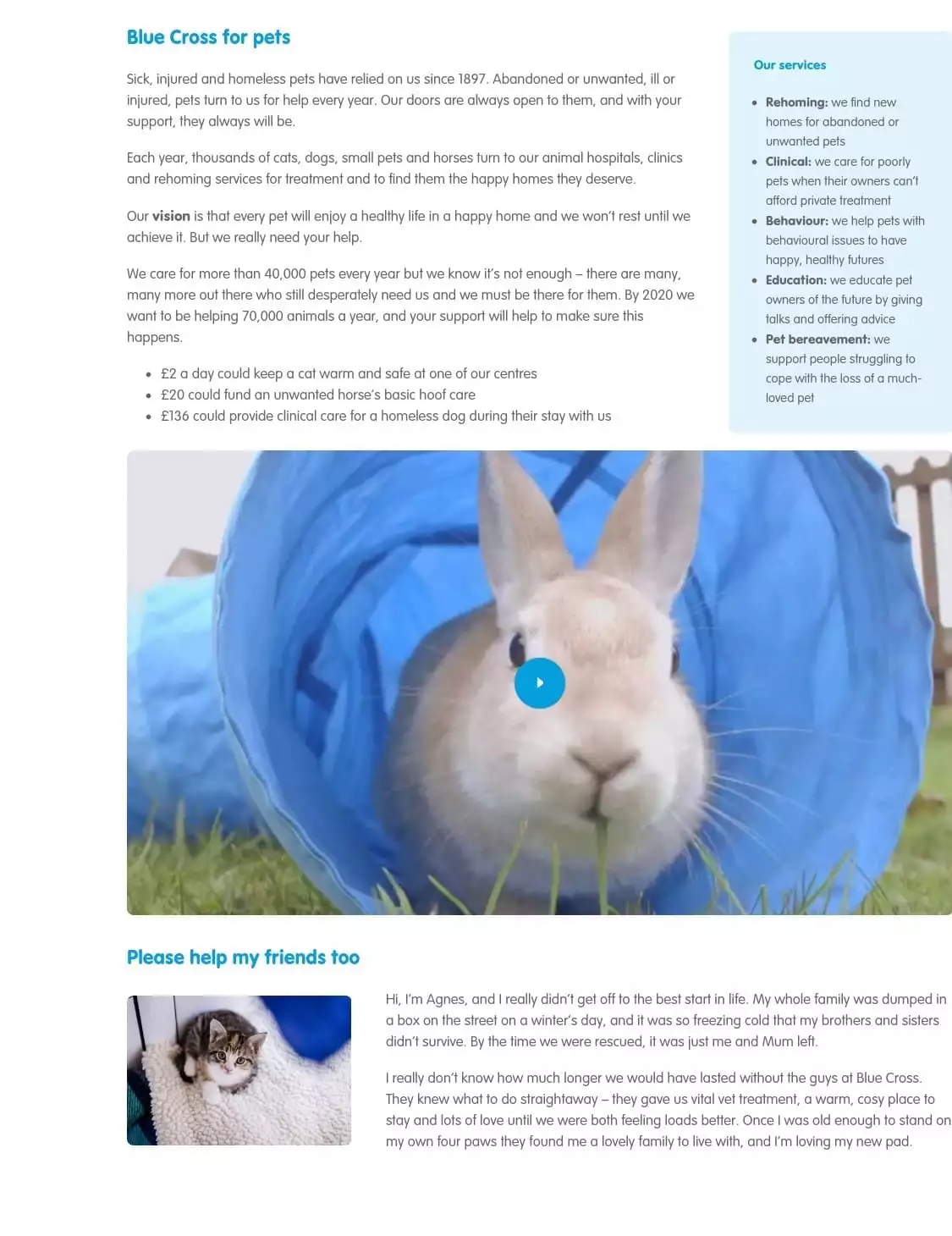
Blue Cross places the mission front and centre on the page and goes one step further to place you, the reader, front and centre to the animals’ welfare. With a clever use of language, you feel the vulnerability of the animals they care for and throughout the page they place the animals’ future in your hands. They quantify their mission with a bold statement and back it all up with a story from a beneficiary (I know, I know…but it works!).
Couple that with a video that pulls on the heart strings and it’s certainly an emotive About Us page! It’s an effective use of the page to move the reader another step closer to supporting them – the page is littered with nudges, ‘asks’ are wrapped up in the copy – a great use of subtle (and not so subtle) messaging.
Advertisement
3. Breast Cancer Now
Making the most of the page by… sharing their aspirations
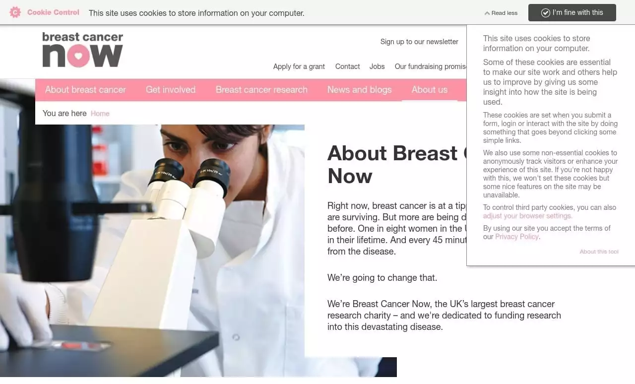
The page leads with the uncomfortably stark reality of the situation being tackled by Breast Cancer Now and thanks to bold, affirmative statements the page tells us plenty about the charity in the first few words – they’re ambitious, determined and dedicated. None of the usual long-winded narrative.
Such strong statements engage you in their fight and in that very moment an effective call to action at the foot of the page provides several options to play your part in the fight against breast cancer.
4. Action for Children
Making the most of the page by… connecting the reader through storytelling
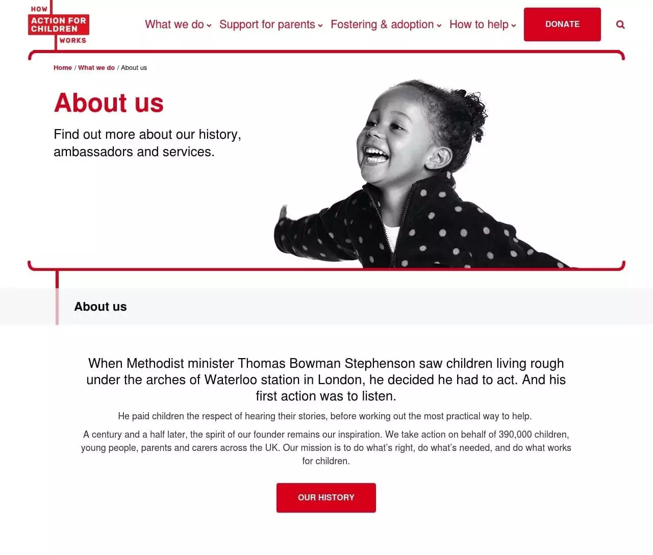
Every charity has its history and it’s almost always found lurking in a factual corner on the About Us page. Want to know about Action for Children’s history? Then head to their About Us page. The difference is that they use storytelling to connect the modern-day £160m charity with its humble beginnings – a heartwarming account placing a face behind the powerhouse charity. It’s an investment in their relationship with the reader not an account of how they came to be.
5. Red Thread
Making the most of the page by… humanising the organisation
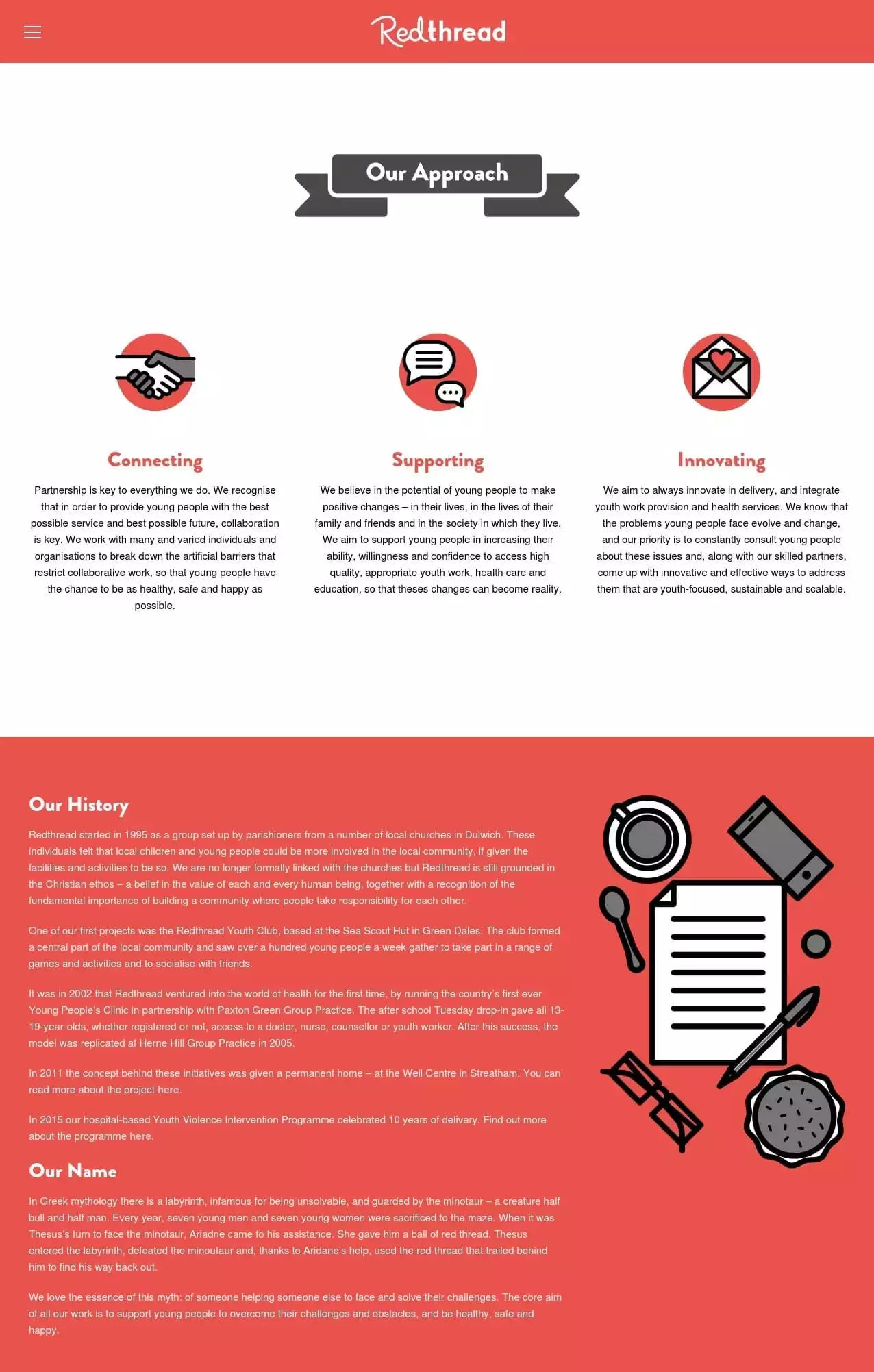
Red Thread’s page reminds us how important it is to make sure every part of a website reflects the character of the organisation, their page is youthful in design and welcoming in its copy. With a clever use of icons they’ve embedded their character into one of the most challenging pages design-wise and the result tells us more about the organisation than just the words on the page.
In a striking balance, the remainder of the page humanises the organisation and takes us behind the scenes to meet those who are at the heart of it, those who contribute to its character.
6. BACA
Making the most of the page by… sharing its story through video
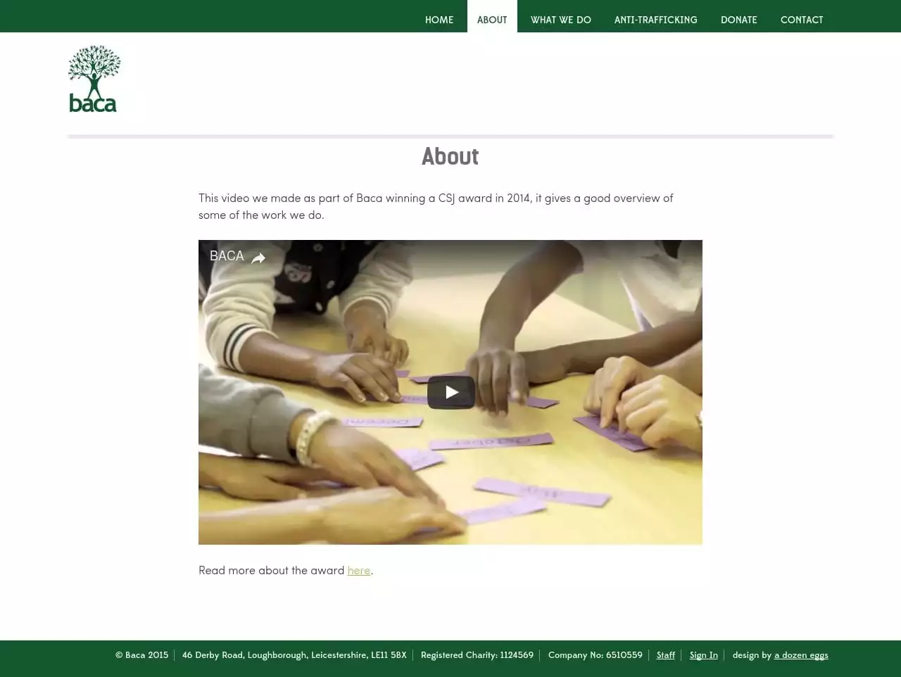
This is a unique way to use the page. Yes, it features video and yes many others use video too, but how many use just video? There are no words to support the content and the impact is all the better for it. This page shows just how versatile video content can be and how powerful it is in sharing the message.
7. The Parent House
Making the most of the page by… using design to enhance the copy
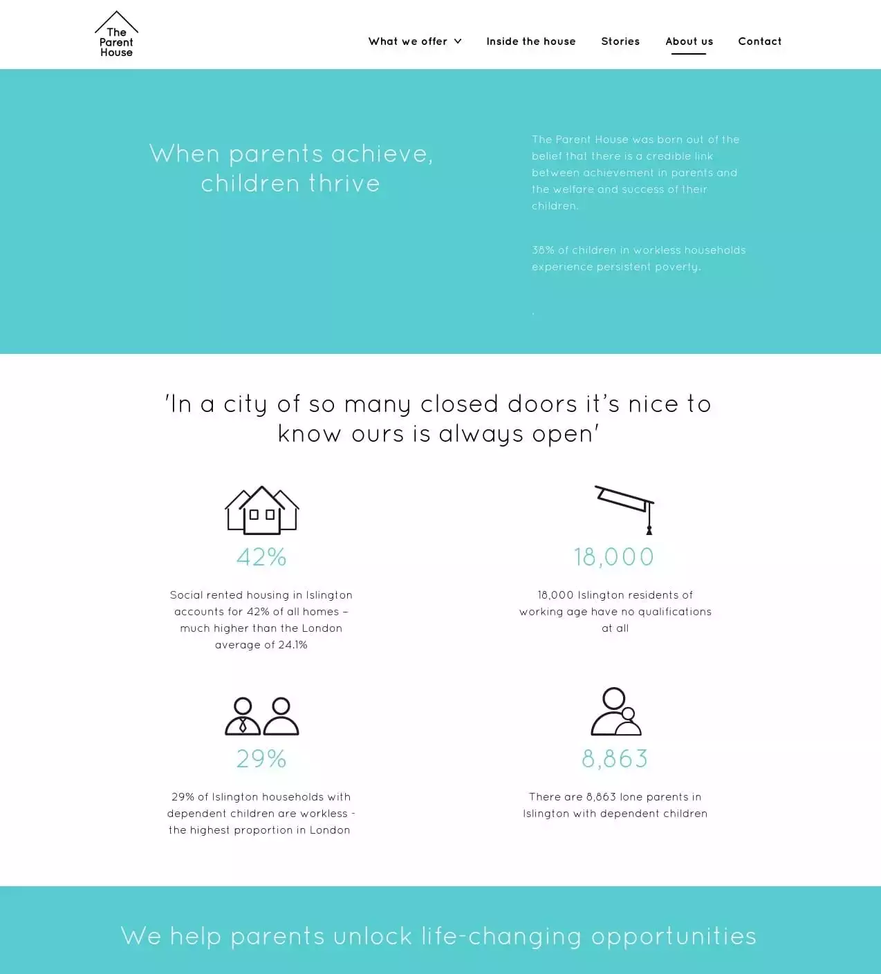
This page is less about the organisation and all about putting their work into context using effective visuals. From the problem they’re addressing to how they approach their mission, it’s all there in a combination of sleek, minimalist design and copy which reflects their ethos, it tells you all you need to know in few words.
The use of infographics to share headline stats is effective and sits in contrast to the rest of the page, helping to amplify their point. The usual corporate information is woven in seamlessly and sits secondary to the cause helping to keep the focus on the mission.
8. Cool Earth
Making the most of the page by… using stunning visuals
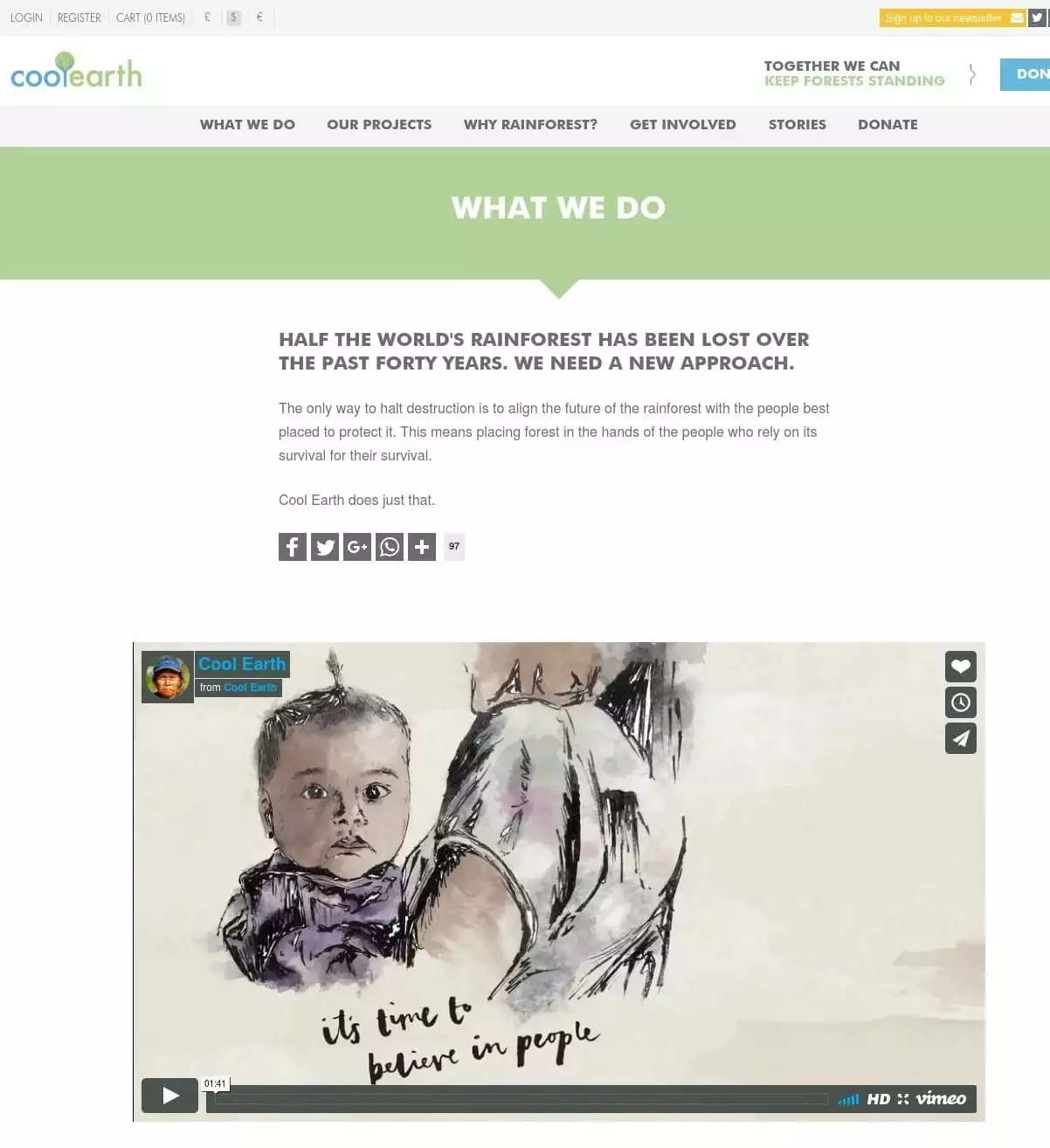
Pictures speak a thousand words and on the page aptly titled ‘What we do’ (in place of ‘About us’) Cool Earth shares much about who they are through stunning images and a clever use of minimal words. For a page traditionally text heavy this is a departure and it works beautifully. Perhaps surprisingly the video isn’t the star of the show with the static images narrowly pipping it to the post but it is certainly the icing on the cake.
The third sector is amazing – we do some pretty powerful stuff and we do it well, but that doesn’t mean we can’t learn how to do things differently, or better. Sometimes we have to look outside the sector to develop within it, so here’s an example of an About Us page from the commercial sector and we could certainly learn a thing or two from it…
9. PKF Cooper Parry
Making the most of the page by… challenging perceptions
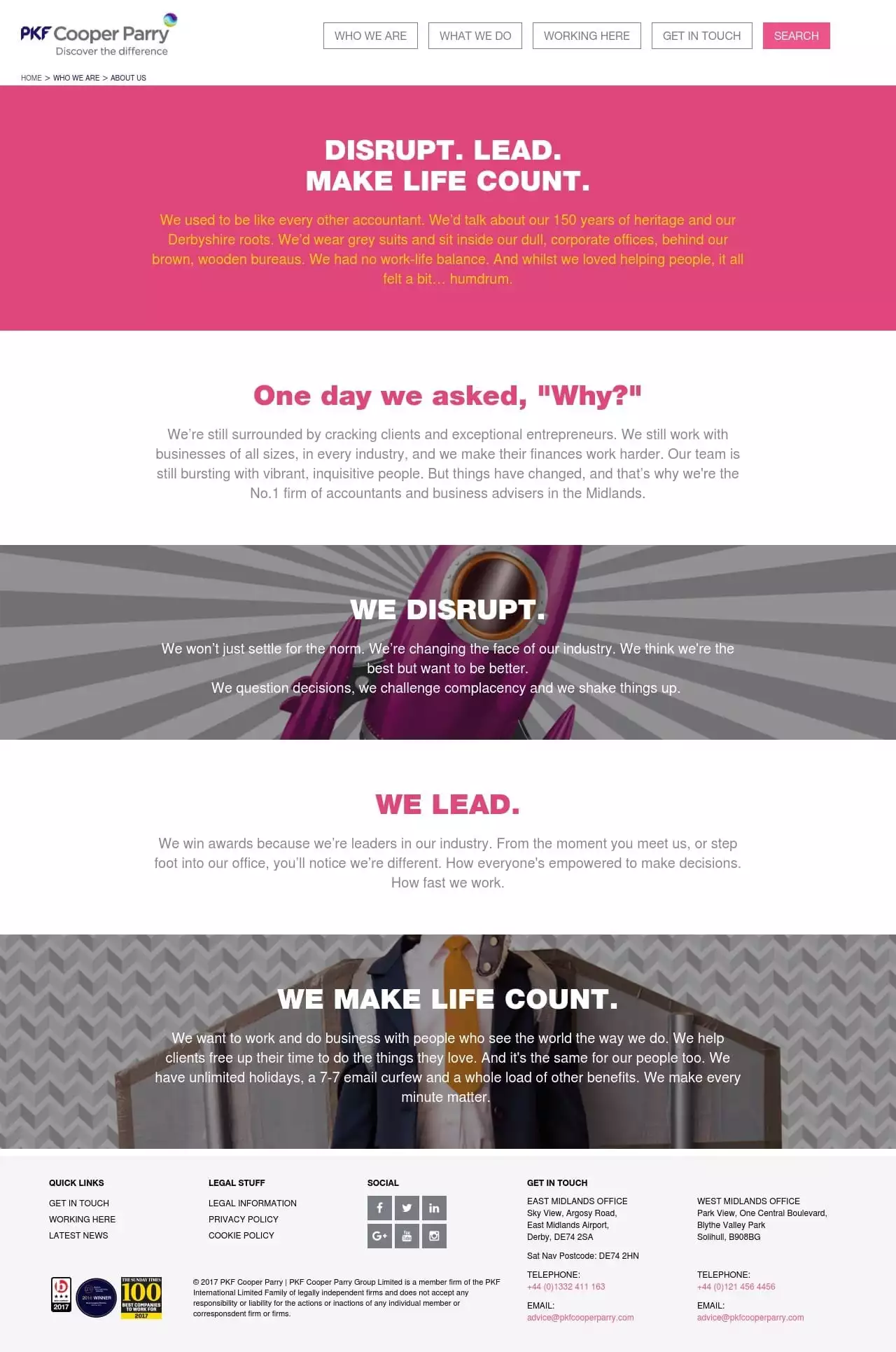
Cooper Parry has broken the mould and they have done it spectacularly well! Take a glance at their page and (if you don’t already know), I challenge you to guess their industry…digital perhaps, surely a marketing agency, or possibly an organisation working within the creative industry… they are a firm of accountants! From the colours to the design to the outstanding copy, everything challenges the perceptions of their industry.
An ingenious use of words humanises the brand with a character so likeable it’s hard not to want to work with them (or even for them!)! From the first few words – and in those crucial few seconds in which we decide whether or not to read on – it makes you sit up and take note. Amongst the client-focussed quirky copy they evidence their credibility using a style that certainly disrupts.
I promised ten examples of great About Us pages so for the last one its over to you. Let me know which charities you think are making the post of the page…
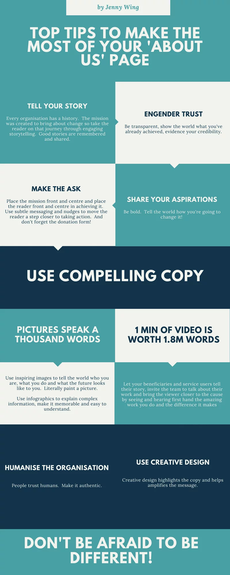
And if you’re looking for inspiration for your own page, here are a few top tips to get you started…
Jenny Wing has worked in marketing and communications for 15 years, and has spent 10 of those in the third sector, specifically within fundraising. She can be found baring her professional soul on LinkedIn.
![]()
![]()
About Howard Lake
Howard Lake is consultant editor of UK Fundraising. He founded the site in 1994 and successfully sold it in 2022. As director of Giving X Ltd he is exploring growing giving on a massive scale.
He is the founder of Fundraising Camp and co-founder of GoodJobs.