Epilepsy Action unveils first new brand identity for more than 20 years

For the first time in over two decades, Epilepsy Action has revealed a new brand identity. It has been designed with contribution from people who have the condition to visually represent the disruption it can bring, as well as the forward-looking direction the charity is taking.
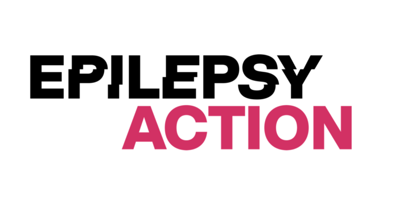
In the new logo, an ‘interrupted’ font has been used for the word ‘epilepsy’ to represent the life-changing impact of the condition. The word ‘action’ is in a clear-cut font, representing how people with epilepsy can live a life without limits, with the right treatment and support.
The new look follows the launch of the charity’s new six-year strategy to create a world without limits for people with epilepsy.
Advertisement
Epilepsy Action gathered feedback from supporters to build the concept, with the “interruptive” nature of epilepsy emerging directly from their experiences.
Many highlighted a lack of public understanding of what it is like to have epilepsy as one of the main barriers they faced. To change the perception of epilepsy, the charity needed to make the condition visible and understood.
Some described feeling like “life had just stopped”, or like their “whole world was turned upside down” after getting their diagnosis. Others described living with epilepsy as “doing a jigsaw without all the pieces or knowing what the picture looks like”.
Tom McLaughlan, from Cumbria, was diagnosed with epilepsy in 1982. He doesn’t get any warnings for his seizures, and his life has been disrupted by his condition many times, making ‘interruptive’ a key word to describe it.
He said:
“I get no warnings about my seizures. The first I know about it is either when someone tells me I’ve had a seizure, or if I’ve been on my own sometime afterwards, when I realise what’s gone on or what must have gone on.”
Commenting on the new brand identity, Jon Eaton, director of Communications and Digital Engagement at Epilepsy Action, said:
“Last year, we heard from more than 5,000 people with epilepsy as we developed our new strategy. So many told us they needed us to make epilepsy more visible, to remove stigma and make the public more aware.
“What makes epilepsy unique from other health conditions is the fact it is unpredictable. We wanted to get across this reality in our new brand.
“Reaching as many people as possible, especially outside of the epilepsy bubble, is one of our main goals for the next six years. We want everyone to know what epilepsy is, and how they can help someone with the condition. We’re hoping having a new, instantly recognisable look will let us do exactly that.”


