Why fundraisers need to improve their user experience online
For fundraisers, not-for-profit organisations and companies working in the third sector, it is often difficult to create a website with an engaging user experience due to the volume of information that needs to be digested by a variety of users.
In addition to this, 11 million people in the UK currently live with an impairment or disability – whether it be cognitive (learning), physical (motor), visual, or auditory – that affects how they navigate a website. As a result, many companies in this sector are failing to offer an online experience that meets the needs of most users, and they could be suffering as a result.
Last month we released our report – entitled ‘The third sector online experience – who is hitting the mark?’ – into the user experience of 10 not-for-profit websites. It flagged some issues that we believe must be addressed by the third sector in terms of their online approach.
The websites we tested and their overall user experience (UX) score out of a possible 25 were: Citizens Advice (19), The Prince’s Trust (17), Victim Support (16.5), British Medical Association (16.5), Age UK (15.5), Step Change (13) War Child (11), Trafford Housing Trust (11), Business in the Community (BITC) (10), and SportsAid (9). And these results are concerning.
What is user experience?
User experience, or UX, is the technical term that covers all aspects of an end-user’s interaction with a company, its services, its website, and its products. And due to the breadth of third sector target audiences and their varying requirements, getting core messages across and in particular providing a smooth digital journey for all users, can be a real challenge.
Why user experience is important in the third sector?
There are a number of areas that are important to get right to create a website with an inclusive user experience. Usability, mobile-friendliness, accessibility, and self-help functions are just a handful.
Websites are increasingly becoming the first port of call for the public reaching out to a charity or not-for-profit, and the experience a user has on the website can affect their next steps. For fundraisers, this means online donations. And as online donations to charities across the board have risen by almost a third over the past four years from £52.87 in 2010 to £69.70 in 2014, this channel is crucial for those gathering donations and fundraising.
In our testing, across the board the websites were particularly strong on links that have hover state, breadcrumb navigation, and using good terminology – which are all positives for usability. However, half of the websites we looked at were lacking on small things like consistency of font sizes, alt text on images or clear calls to action.
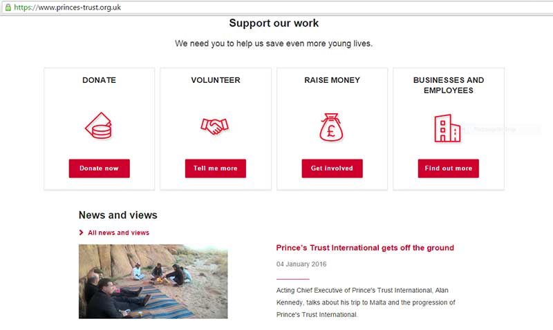
One website that offers good usability is The Prince’s Trust. Some of the ways that the website excelled at usability include:
Advertisement
- the website’s links have a hover state
- the site contains breadcrumb navigation
- it uses good terminology
- and it has consistent font sizes.
How to nail user experience on the head?
Overall, half of the websites that we looked at didn’t contain a HTML sitemap or have intuitive navigation – which in our experience demonstrates a lack of investment in usability.
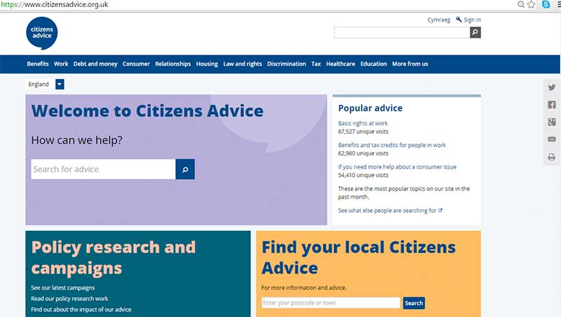
One website that is doing this well, however, is Citizens Advice, with strong content, clear navigation and useful tools:
In the build and design of any site, how users interact with it is the most important element. And this should be the first issue tackled by organisations in the third sector that have a website that isn’t particularly user friendly.
Mobile friendliness
It is not uncommon for not-for-profit websites to be slightly behind when it comes to digital trends. However, being reachable on mobile devices is increasingly becoming a necessity for all businesses with an online presence. Three of the 10 websites we looked at in our report hadn’t taken any steps to become mobile-friendly, which is surprising.
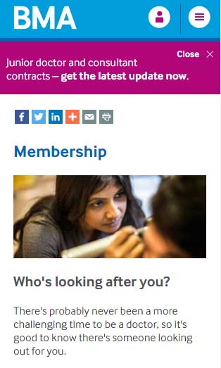
However, one website that is championing in this area is the British Medical Association, who have a dedicated mobile version of the site:
All websites need to take steps to become mobile-friendly or they risk missing a large chunk of their target audience as well as existing donators who regularly use their service – as increasingly we move online.
The positive effect that user experience can have on a website
To avoid being left behind in the digital stakes, fundraisers need to invest resource into their websites, as attracting donators becomes increasingly competitive. Those that haven’t optimised this channel will likely be overtaken by organisations that have a more flexible approach for users.
Hilary Stephenson is managing director at digital UX agency Sigma.


