Breast Cancer Campaign's Annual Review focuses on geographical diversity

Howard Lake | 2 August 2006 | News
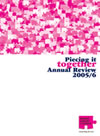

Breast Cancer Campaign’s Annual Review has this year been designed to reflect the Campaign’s geographical diversity, with creative use of the Campaign’s signature jigsaw puzzle image.
Designed for the third year running by not-for-profit sector branding specialists Spencer du Bois, the 2006 Annual Review has illustrated the Campaign’s reach by breaking the British Isles into hundreds of pieces of a jigsaw puzzle, the charity’s logo, and quoting those involved with the Campaign.
Titled ‘Piecing it Together’, the report illustrates the progress the Campaign is making. It has been designed with two different size pages, the large pages with full bleed, saturated images and the small pages representing what the Campaign does and is working towards.
Advertisement
The 30-page report will be distributed in hard copy format to key stakeholders and it will be available to download as a PDF from the charity’s website.
![]()
About Howard Lake
Howard Lake is consultant editor of UK Fundraising. He founded the site in 1994 and successfully sold it in 2022. As director of Giving X Ltd he is exploring growing giving on a massive scale.
He is the founder of Fundraising Camp and co-founder of GoodJobs.