
GOSH Charity refreshes branding to increase relevancy & inspire more support

Melanie May | 25 June 2024 | News
GOSH Charity has today revealed a refreshed brand identity with the objective of driving relevancy and helping it connect with potential donors and supporters more effectively.
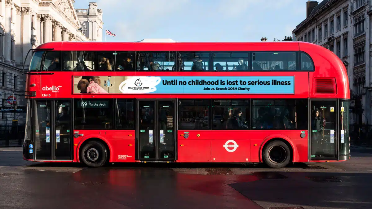
The brand identity launches alongside a targeted brand marketing campaign featuring digital and non-digital out of home, radio and earned media that highlights the reality of childhoods impacted by serious illness, as well as the hope and determination to improve and save more lives through groundbreaking research and the best possible care and support for patients and their families.
Advertisement
The charity says its refreshed visual identity is rooted in its history with new design elements introduced to inject personality and distinctiveness.
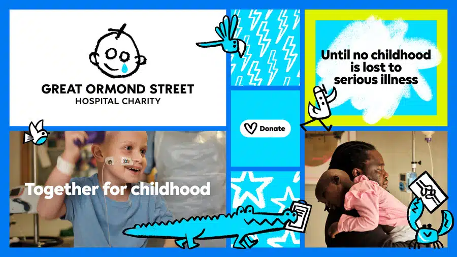
Updated logo
This includes its logo, which was originally designed for the Wishing Well Appeal in 1987, with the distinctive teardrop face was inspired by a young patient’s drawing. The updated design incorporates this, and introduces elements for a distinct, digitally native identity system while also improving accessibility and legibility across print and digital channels.
The charity has also introduced blue as its beacon colour to provide greater accessibility, recognition and stand out. The colour is used in the teardrop of its logo and has been amplified across the brand design system to drive greater attribution and recognition of the brand.
New illustrations
New animal illustrations, inspired by the ward names at Great Ormond Street Hospital, have also been introduced. These are unique to the charity’s brand identity and represent the collective efforts of the “doers” who are transforming the lives of children under the hospital’s care. When animated, the charity says they give a sense of movement and togetherness as well as representing the fun and playful spirit at the heart of the brand’s renewed focus on childhood.
The ability to animate the animal characters as well as the new font and pen stroke has been a key consideration throughout the project, as the charity looks to create greater impact on digital channels.
More direct tone of voice
The charity is also taking a more direct tone of voice to reflect its determination to stop at nothing to protect childhoods from the most rare or complex illnesses. The new brand puts children’s lived experiences front and centre with improving accessibility and legibility has been a key consideration behind the changes made.
Consultation process
The brand refresh involved consultation involving around 3,500 stakeholders ranging from patients, families and staff at GOSH, to the charity’s employees, high value donors and corporate partners and members of the public.
The project was overseen by the charity’s in-house Brand team, drawing on external expertise. Impero developed the brand strategy, Stuart Gough and Pentagram led the creative direction for the brand identity and narrative, and JKR developed the new motion identity.
Emma Guise, Director of Marketing and Communications at GOSH Charity said:
“The world has changed enormously in recent years, and we hadn’t updated our brand since 2017. Our refreshed identity, designed to be more accessible, inclusive, and digitally enabled, symbolises the progress we’re driving for seriously ill children and underscores the collective role we all play in realising it.We hope the refreshed brand will empower us to be more relevant and inspire our current and new audiences to get involved.
“Patient families at GOSH have been central to our decision-making process; their call for boldness and acknowledgment of the harsh realities of serious childhood illness resonated deeply. Alongside this, our unwavering focus on childhood and the vital role we play in protecting every element of it felt absolutely critical to bring through our new look and feel.
“We’re hugely excited by what our refreshed brand will enable us to do, better communicating our purpose and inspiring more people to join us in our mission. Ultimately, this means we can have a bigger impact for the hundreds of children from across the UK who are treated by GOSH every day, and for children with rare or complex illnesses everywhere, both in this generation and those to come. Because we believe that no childhood should be lost to serious illness.”
![]()
About Melanie May
Melanie May is a journalist and copywriter specialising in writing both for and about the charity and marketing services sectors since 2001. She can be reached via thepurplepim.com.