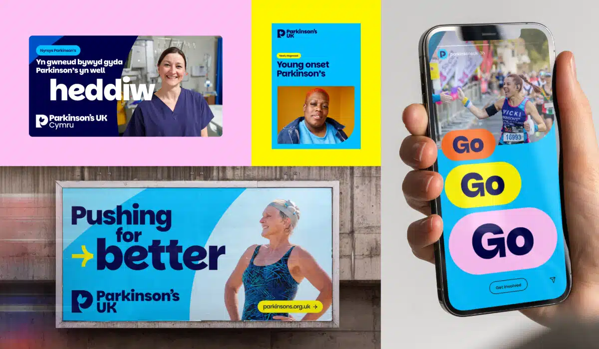
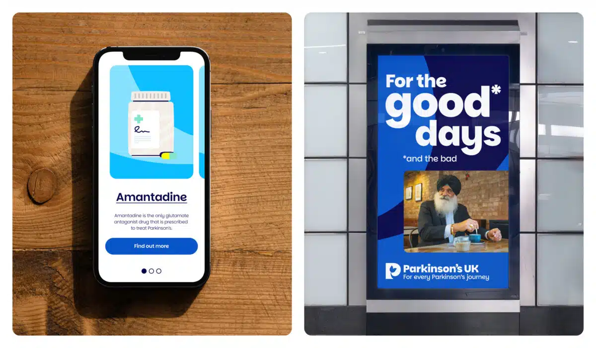
Parkinson’s UK updates branding to improve accessibility & relevance to everyone impacted by condition

Parkinson’s UK has today (15 January) revealed updated branding, including a new logo and strapline, and a bespoke accessible font.
The changes seek to make the brand more visible, accessible and relevant to everyone affected by Parkinson’s, with the updated identity aligning with the charity’s ambition to campaign for improved health and care, fund research into new treatments and run life-changing support services to people living with Parkinson’s.
Advertisement
The changes also reflect a strategy change at Parkinson’s UK, with a community-first approach, which means keeping those living with the condition at the heart of its work, as well as those giving them care and support.
The new strapline, ‘For every Parkinson’s journey’, has been chosen to represent the charity’s commitment to being there for everyone.

Central to the visual identity is a new logo incorporating a tulip symbol, which is inspired by the charity’s past and recognised by the Parkinson’s community. It harnesses the tulip variety developed by Dutch horticulturist J.W.S. Van der Wereld, which he named after Dr James Parkinson in 1980. The tulip has since become an international symbol for Parkinson’s. The new-look brand also features a bespoke, accessible font, Parkinsans, with a range of images, icons and illustrations in a new brand colour palette.
Caroline Rassell, Chief Executive of Parkinson’s UK, said:
“Parkinson’s is a complex, often misunderstood condition, which can impact people in so many ways. Looking for answers and support can feel lonely and daunting, so we are determined to reach more people, offering them expert information and helping them to navigate daily life.
“For 55 years, Parkinson’s UK has provided information and support to the Parkinson’s community. Back then, it was our founder Mali Jenkins who was struggling to find what she needed. Now we have 153,000 people and their loved ones looking to us for expert advice and help navigating daily life. Updating our brand makes us more accessible and relevant to them, as well as scientists and health and social care professionals. Including everyone in our work means we can continue to offer the right services and ultimately find better treatments.”
Juliet Tizzard, Director of External Relations at Parkinson’s UK, said:
“With a strategy focussed on living well with Parkinson’s today, we knew our brand had to live up to that promise. Working with the wonderful Red Stone and Mark Radda, specialists in charity brand strategy, accessibility and creative design, we’ve been able to reflect the wants and needs of the Parkinson’s community in our brand.
“We’re so grateful to the many people with Parkinson’s for helping to shape our refreshed brand. Their insights and influence give us the confidence that we are doing the right thing: building a strong, inclusive and supportive community, relentless in our mission to have a positive impact on the lives of people with Parkinson’s, today.”
More than 1,000 members of the Parkinson’s community were consulted throughout the process to ensure the brand reflects their experiences and challenges. The charity had also identified the need for a more unified brand tone and design across everything from research and healthcare engagement, to fundraising and helpline services.


