Experimenting with the donor experience to increase donations
For non-profits and charities, testing assumptions and ideas can provide the chance to dramatically improve fundraising, as well as offer the opportunity to better understand donors. Testing anything from how to increase email signups to where the charity puts the web page headers can change the experience of visitors on the website, and in return, encourage them to click through to make a donation.
Testing, or ‘experimentation’, is how non-profits succeed in today’s increasingly challenging market for charities. Research by the Charities Aid Foundation (CAF) shows that the proportion of the UK public who gave money directly to charity in 2018 dropped to 57%, compared with 60% the previous year. It’s a tough climate in which to succeed as a charity, so it’s time to look at the ways the sector can do things differently to drive donations higher than ever before.
Getting the click-through you need
Guesswork has often been at the centre of many strategies for charities. Updating the website banners, colours and wording are often based on gut feel but not data. This often means that changes can negatively impact the way a donor will feel on the website, and as a result, either encourage or turn them away from donating. Testing these assumptions first, before rolling them out widely, can help determine which options will provide the most substantial outcome.
According to the IoF’s Fundraising for Impact, improving the experience of current supporters is the number one current area of focus for charities. Ensuring that users have a seamless and pleasant experience increases the chances of a successful donation. People will spend time on the website browsing, reading blogs and watching videos but taking the next step to encourage visitors to click the donate button is hard work. Testing different layouts of the website and Calls-To-Action (CTAs), can help a charity determine which format works best in order to have people click to donate.
A fine example is Movember. It had the hypothesis that increasing the prominence of the call-to-action (CTA) and adding human-centric imagery would drive more clicks. As a result of testing out this idea, Movember increased fundraising asks via Facebook and email by 32% and 28% respectively.
Simply moving buttons and increasing their focus on a website can impact how people respond, and ultimately, feel more compelled to complete their donation.
Experimenting with higher donations
However, once a charity has secured a donor’s interest, the next challenge is motivating them to donate as much as possible.
For Charity Water, which helps provide drinking water to people in developing nations, most donations come through online channels. With this in mind, making sure the online experience for users was seamless was important but so was increasing the amount that people donated too.
The charity decided to experiment with the amount it pre-filled in the input box when people donated. It previously input $20 or $30 so decided to experiment with higher numbers. It found that a better pre-fill for average donation size, without reducing the conversion rate, was $60. By trialing the change with a small user base, without impacting how everyone experienced the website, the team minimised the risks to the charity on losing out on all important donations.
Advertisement
Testing to improve fundraising campaigns
For charities where donations come through during peak fundraising campaigns, ensuring all channels are performing at their best is crucial to success. Determining how a campaign should be run, should be based on data, and not gut-feeling.
One charity that did this well was Cancer Research UK. In 2017, the “About Cancer” section of Cancer Research UK’s website amassed over 25 million visitors and in the same year, it raised over £30 million through its online fundraising platform too. It’s clear to see that the charity relies significantly on its online presence to drive donations.

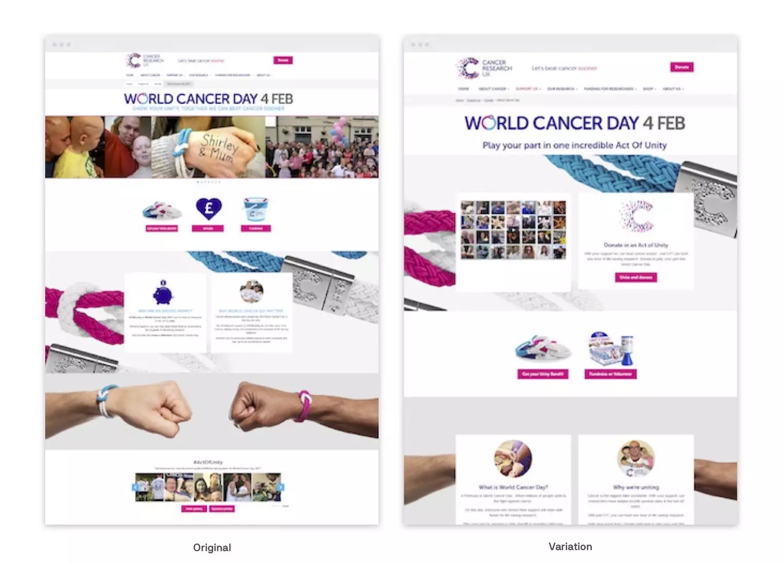
Cancer Research UK tested different approaches on its World Cancer Day landing pages
As a result, it decided to test the user interaction to analyse which channels provided great, and not so great experiences for users. Through A/B testing on its landing pages, it found that excessive noise and undefined CTAs were negatively impacting on user engagement. With this data, the team developed a second version of the landing page which provided users with a streamlined journey with clearer CTAs and reduced noise.
Without being able to test, Cancer Research may not have been aware of the challenges that users were facing and continued to give certain donors a poor experience of the charity’s online channels.
To continue to do great work, charities have to think differently about how they improve experiences for users. Simply being online is not enough to secure donations and encourage users to get involved. Making updates and changes without first analysing the impact can put the charity at serious risk. Being able to test and see the results of new ideas before they are rolled out to all users can help charities determine which experiments will positively impact fundraising efforts, and even in some cases, increase the size of donations people make.
Alasdair Henderson is General Manager UK at Optimizely.


