How to use UX design techniques to improve the supporter experience
As a User Experience (UX) Designer my single biggest objective is to understand users. Not just what they do, but how and crucially why they do it.
For fundraisers, knowing your supporters and what motivates them is the bread and butter of your day job. There is no one better placed than you, the person coming into regular contact with supporters, to build a deep understanding of their motivations, needs and how these might be met. The challenge can be making sure that the rest of the organisation from comms and marketing to the finance team truly understand your supporters needs and can act quickly to help meet them.
Prior to moving into User Experience Design I spent several years working with fundraising teams.
I’ve been thinking about how the tried and tested User Experience Design techniques I use could be used by fundraisers to improve supporter experiences.

User interviews
It’s all about building empathy for your supporters
The ideal starting point for any UX design project is getting to know your users. The easiest and most obvious way to do this is to talk to them.
To get to the root cause of something UX designers often use the 5 Whys technique. The thought behind Five Whys is simple — ask a ‘Why?’ question five times in a row. By the time you answer the fifth question, you should be very close to the deeper insight behind something.
An example of this from a fundraising perspective could be:
Fundraiser: Why are we not putting on this fundraising event again?
Supporter: Because we’ve done it once already
Fundraiser: Why would we not do it again?
Supporter: I don’t think people will want to do it again
Fundraiser: Why would people not want to do it again?
Supporter: Because they will be looking for something new
Fundraiser: Why would people be looking for something new?
Supporter: Because we haven’t got as much money this time to invest in making the event as special
Fundraiser: Why is there less money to spend on the event?
Supporter: Because our sponsor has pulled out
The fundraiser now knows the real reason behind a supporter not wanting to repeat a successful event and can address this issue directly.
You can also use this technique to get to the bottom of why someone is supporting you. If you see patterns emerging it could help shape your organisations strategy and messaging.
Consider training your supporter care team in this technique and make sure they are feeding the results of their conversations back to you.
Telling supporters stories
UX Designers are responsible for making sure that users are at the heart of organisational strategies. We spend time finding ways of representing users in engaging and visual ways that help to build empathy. This informs our design and is great for engaging stakeholders. I’ve outlined some of the key ways of doing this below:
Advertisement
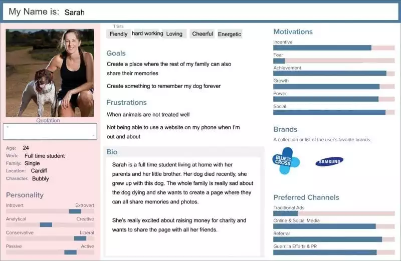
Personas
Summarise key insights of users with common traits in a visual way that can be used to help everybody better understand them.

Example persona
Storyboards
A great way to think through an interaction or goal from the user perspective through comic book style storytelling.
Emotional paths
Thinking through the touch points somebody has with an organisation/experience and overlaying this with any emotional highs and lows. This really helps to identify potential areas for improving the user experience
Why not try producing some of the above for your key supporters. They don’t have to be perfectly designed to be impactful. It’s a great way to share the insight you have with colleagues and generate some new ideas in the process.
Competitor and trend Analysis
Keeping up to date with what else our users are interacting with and on emerging technologies, means we can make sure we are meeting our users expectations in our designs.
Selecting organisations that you admire and taking some time to regularly review them will help keep your thinking current and play a key role in ensuring you don’t fall behind your supporters expectations. Present the results to your colleagues to encourage debate and fresh thinking
Ideation
Once we have built an understanding of our users with some of the techniques described it’s time to start developing ways we can meet their needs.
There are lots of techniques for generating fresh ideas and testing them quickly. Key to success is being clear about exactly what it is you are trying to solve or improve and then getting the right people together to tackle it. Do some research and find which approaches work best for you.
Prototyping
Consider involving key supporters in idea generation workshops and make sure you know what tools there are for testing a new idea quickly and cheaply with the general public. Some of these include:
- Squarespace for setting up a website using simple templates
- Shopify a quick way to start selling products online
- Eventbrite for promoting events and selling tickets
- Facebook advertising to target small groups of people and get a quick reaction to your idea
- Using surveys to get quick feedback on ideas
Other things to consider
Break down barriers with your digital team. Suggest regular insight sharing sessions and express an interest in collaboration on digital projects.
If you work with agencies don’t just go to them with a list of requirements, Work with them to formulate those requirements through building a shared understanding of the supporter. Share all the insight you have and let them gather more. This will increase the perspective on the problem and the agency will be fully immersed with the supporters needs.
Cherie Chambers is UX lead at Addition by WPN Chameleon. Addition work with charities to create user centred digital products and experiences.


